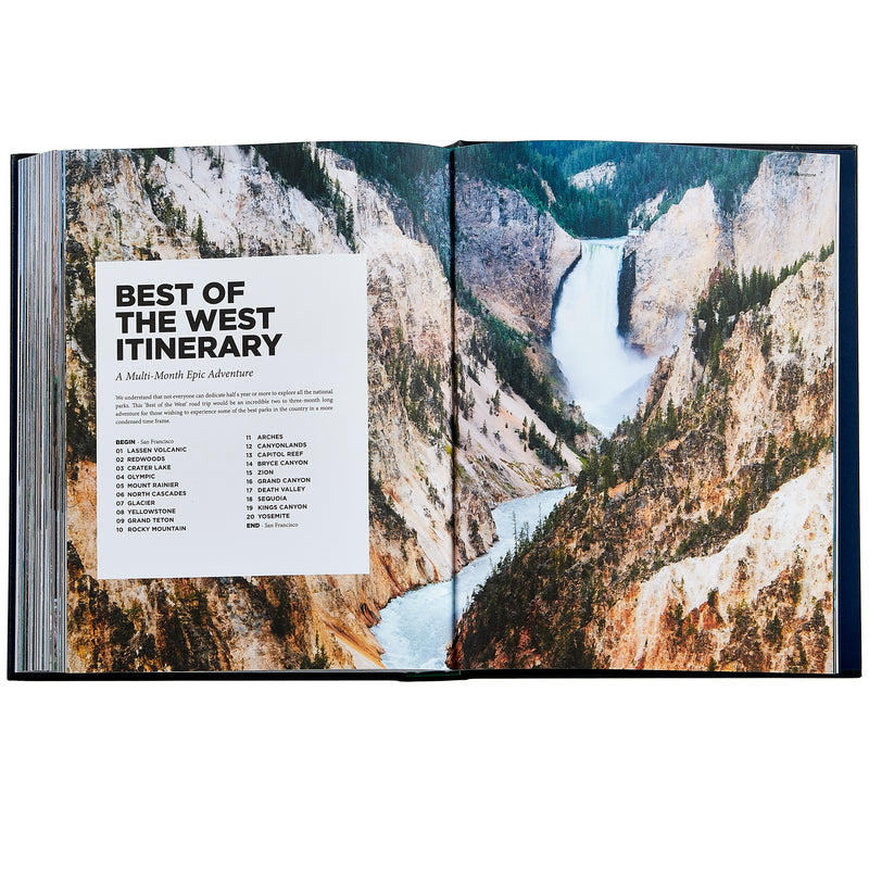
Above is a page layout from Roaming America is a comprehensive guide to the U.S. National Parks, compiled by professional travel photographers Renee & Matthew Hahnel. Through stunning visuals and personal narratives, it captures their seven-month journey exploring every national park in the USA. The guide offers essential planning details, recommended itineraries, and insider tips to inspire and empower readers to plan their own unforgettable adventures in America’s natural treasures.
Typography Classification

Above is first a Sans Serif font which can be characterized by its clean, simple lines and a modern, minimalist appearance most normally recognized by its lack of serfs and monoweight. Which is contrasted by the Oldstyle typeface below, which is also italicize. Oldstyle is recognized by its diagonal stresses and serifs of lowercase letters are always at an angle.
Typeface Contrast

The two tight faces Sans Serif and Oldstyle as shown above clearly do not conflict but contrast. Contrast is easily portrayed in the type faces because they’re very little to no similarities between the two such as the weight of the Sans Serif is monoweight while the Oldstyle goes from thick to thin. Even more obvious is one font is the italicized while the other is not. Lastly, the noticeable difference between the lack of serifs in the Sans Serif, and the notable serfis in the Oldstyle.
Photography

Showcased in the image is the rule of thirds. The rule of thirds is an important visual composition because it guides the placement of key elements within an image or design, creating balance and visual interest. By dividing an image into thirds both horizontally and vertically, it encourages the placement of focal points at the intersections of these lines or along them, rather than dead center, leading to a more dynamic and engaging composition. Following this rule helps to draw the viewer’s eye naturally through the image and enhances its overall impact and appeal.

Another key photography tool used in the image above is leading leadings. You see that the river is leading the viewer to the box in the page layout. Leading lines are crucial elements in composition as they guide the viewer’s eye through an image, directing attention towards a focal point or creating a sense of depth and movement. Leading lines help to establish a sense of direction, enhancing the overall composition and making it more engaging for the viewer.
Alternative Images
I believe that these images would integrate seamlessly into the page layout because they employ similar photography techniques, notably showcasing the ‘rule of thirds.’ Additionally, they offer a wider perspective and alternative viewpoints
.


